
Designing Compelling and Sustainable Dashboards
Designing Compelling and Sustainable Dashboards
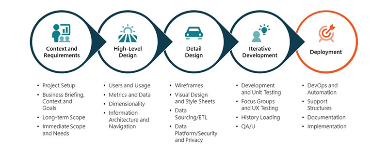
Following a few simple guidelines will increase the odds of designing and building dashboards that are accessible, relevant, and most importantly – used!

Dashboards can be the fool’s gold of the energy and utility performance measurement – lustrous, dazzling, and worthless. While deceptively simple and inexpensive to design and deploy, building relevant dashboards with enduring value is complex. To be valuable, they need to answer some simple questions:
- What behaviours to support strategic priorities and tactical initiatives are we looking to monitor and improve?
- Which metrics will most effectively provide information to spur and support action?
- What audience needs this information, and are they able to take the required actions to improve?
Many dashboards are built without answering these critical questions. Without providing users timely and valuable information, they are frequently abandoned once their novelty wears off. Following a few simple guidelines will increase the odds of designing and building dashboards that are accessible, relevant, and most importantly – used!
The first is relevance. The success of your dashboard initiative depends upon identifying the audience to ensure you clearly understand who will be using the dashboard, the information that will be most engaging, and how to present it to drive the desired outcomes – whether that is information sharing, calls to action or shifts in priorities. Starting with a clear vision of what success looks like will drive change in support of your strategic priorities or tactical initiatives.
Many dashboard projects are hobbled from the outset by their poor metric selection. Metrics must be easy to understand, supported by frequently updated data and trusted by users. A great dashboard will have a good balance of leading and lagging indicators, tactical and outcome metrics.
Using fresh data is another essential feature of a successful dashboard. The frequency of users visiting, and the uptake of the information is directly tied to the cadence of your updates; selecting a few frequently-updated metrics will promote frequent and habitual usage of the dashboard.
Without proper context, metrics are just numbers. Including relevant benchmarks tells the viewer where they are now, where they’ve come from and where they’re heading – trends. They’ll point to key issues and challenges – variances. Finally, they will identify the best and worst performances, which can be a key motivator – contribution/ranking.
MNP has a mature Dashboard and Design Framework that can help you to ensure that your dashboards are relevant and versatile, simple and fresh, sustainable and actionable. Our mantra is to start small and take meaningful steps with data you trust. To learn more about designing and building relevant, effective, sustainable Dashboards, contact an MNP advisor today.
Insights
-
Performance
May 02, 2024
How will the 2024 federal budget impact professionals?
What do professionals need to know about the measures introduced in the 2024 federal budget? Discover five key areas that will impact professionals.
-
Progress
May 01, 2024
Case study: Estate planning when one spouse has a terminal illness
Learn how to plan your estate when one spouse has a terminal illness. Explore various tax implications and asset transfer scenarios with our case study.
-
Performance
April 30, 2024
What should importers expect with CARM R2 and the CN24-14 blackout period announcement?
How will the upcoming changes at the Canada Border Services Agency (CBSA) impact businesses that import goods into Canada?